Modelling Solar PV Output
At the start of November 2022 I had 4.455kWp of solar PV installed, with 11.8kWh of battery storage. The inverter and battery are a Solax X1 Hybrid G4 3.7kWh and two Solax Triple Power 5.8kWh batteries.
The app gives you some nice graphs of your usage, in particular the solar PV output. On a sunny day there’s a definite shape to them caused by the path of the sun and other environmental factors. The screenshot below is from yesterday, the 6th of February.
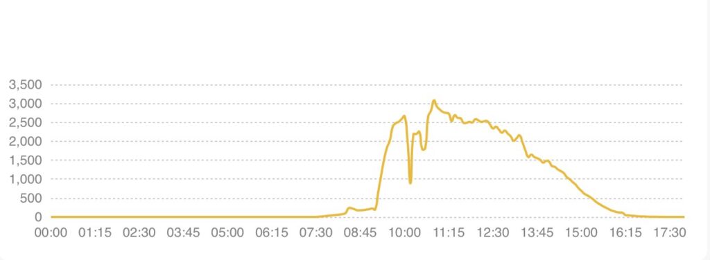
There are four distinct phases in the graph, which are:
- Ambient light starting at dawn when the sun is below the tree line entirely, from about 07:35 to 09:10
- A rapid rise in output as the sun rises through the tree line from 09:10 to 09:45
- A curve based on the angle of incidence of direct sunlight on the panels, ending it about 16:00
- A little bit of ambient light until sunset
The roof is south-east facing at about 140º so falls into shadow once the sun passes an azimuth of 230º.
These phases are fairly easy to model in a simple script, and I used Andreas Möller’s astronomy bundle to get the sun altitude and azimuth for a given location, time and date.
The script has the following parameters that can be tuned:
- Latitude and longitude
- Date
- Sunrise tree line low/high azimuth
- Sunset tree line low/high azimuth
- An ambient light factor
- A cloud factor
The ambient light factor produces some degree of generation, which I’ve assumed to be in proportion to the height of the sun in the sky. It’s also subject to the cloud factor, which attenuates it in adverse conditions.
The direct generation is also attenuated by the cloud factor, and is scaled from the maximum output by the sine of the incident light angle falling on the panels. When the sun is within the sunset and sunrise tree line bounds, the direct output is further scaled in proportion to the progress of the through the tree line bounds.
Finally, the ambient and direct generation figures are added together.
My model compares to the actual output fairly well:
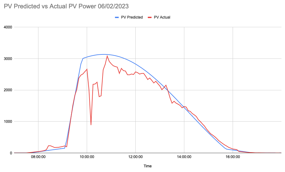
This day, the 6th of February was almost completely sunny, and the actual output was 12.3kWh vs 13.7kWh theoretical maximum. The yield was 11.7kWh which is in line with an expected inverter efficiency of 95%.
But how does this vary through the year? I modelled the summer and winter solstices and put them on another graph together with the February 6th data.
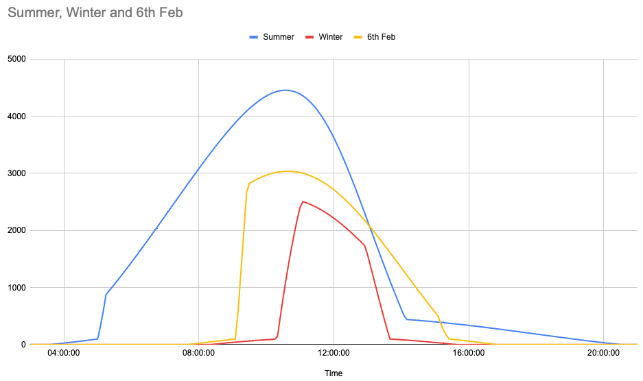
Note that the summer solstice line is shifted to the left as it is in BST rather than GMT. The winter line does look very familiar from a very sunny day in mid December, where the yield was 5.9kWh against a predicted maximum yield of 6.6kWh (after inverter losses). The summer solstice line corresponds to a generation of 28.7kWh after inverter losses.
Plotting actual yield vs theoretical max yield for the year so far gives us a picture of how sunny it has been so far this year. Sunny days, like yesterday, reach almost the maximum generation possible.

I’ll continue to track the daily generation and publish updated graphs through the year.